Whether you’re selling your personal training services, a fitness or nutrition e-book or program, or a series of training plans, it is crucial that you be sure to take into account the tiny little details that will improve sales conversion.
While these 15 killer tips for improving conversion on your online sales page may seem small and irrelevant, they can in fact lead to enormous percentages in sales increase for your programs and services.
Please remember that these tips are for an online sales letter page…not necessarily something like a video sales page, which has it’s own set of important criteria I may blog about later if you like this article.
Read for your 16 Killer Tips For Improving Conversion On Your Online Sales Page? Here we go:
#1: Use a 12pt font size for the sales page body, and a Sans Serif font, like Arial. 12 point font is about 15-16 pixels. That may seem big, but there are lots of Baby Boomers out there.
#2: Use a 36 point font size for the header, a Tahoma style font in a dark red color, and preferably put a drop shadow.
#3: Use a light blue or friendly brown for the page background. Those are trust colors.
#4: Choose a page width of about 700 pixels, which is a width that looks good in most browsers.
#5: Use a solid background – not a repeat, tiled background.
#6: Use a drop cap font in the first paragraph.
This is a drop cap font.
#7: Use animated arrows to emphasize areas that you really want people to click on, like order buttons (see bottom of this article to see what I mean).
#8: Include a product guarantee and include a RED border around the product guarantee.

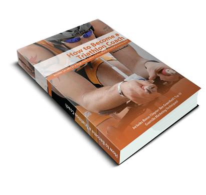
#9: If it is a virtual product, like an e-book or online program, a physical image of the virtual product must be included (i.e. book, box, etc.) – see right for an example of my Triathlon Dominator package.
#10: “Negative” headlines tend to work better (i.e. “Quit Wasting Your Valuable Time Trying To Figure Out How To Make Your Love Handles Disappear” is better than “Get a Flat Stomach Instantly!”)
#11: Any listed bonus items must also have listed “values” (i.e. your free bonus was “originally sold at $97“)
#12: Phrasing on order button is “Add To Cart” (not “Buy Now” or “Purchase” or anything else) and it the words are blue with an underlined link, which is what people are used to clicking on.
#13: The actual color of that Add To Cart button should be orange.
#14: When you list the price, slash-through the retail price, and replace with special price. $197 $97
#15: Include credit card logos and a bank or credit card company verified badge, and make these clickable to your order form.

Do you have questions, comments or feedback about this article? Just leave them below. Ben Greenfield is the author of the book “Personal Trainers’ Guide to Earning Top Dollar”, and in the book, he teaches more concepts just like this.